Call Paths
The problem
The existing Call Paths interface was lacking design affordances and needed a visual refresh. Dialog boxes, buttons, loading states, and icons were all different styles. As part of this project, I added 3 new call path nodes and updated the layout to allow for more later on.
Below is the “before” image and some of the issues it has.
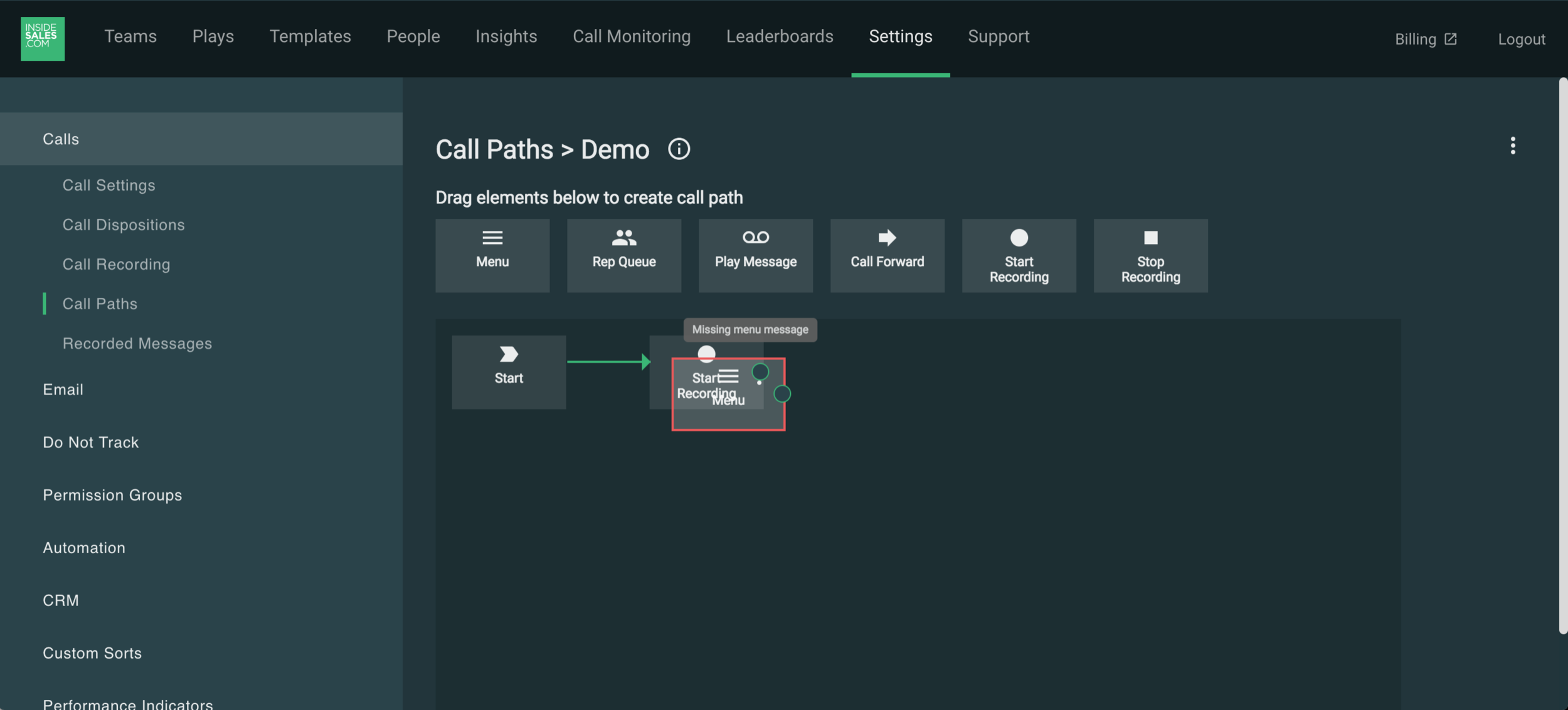
After playing with the existing version myself and talking with 2 lead engineers on this team, there were a handful of quick fixes I could make to improve the look and functionality of the design.
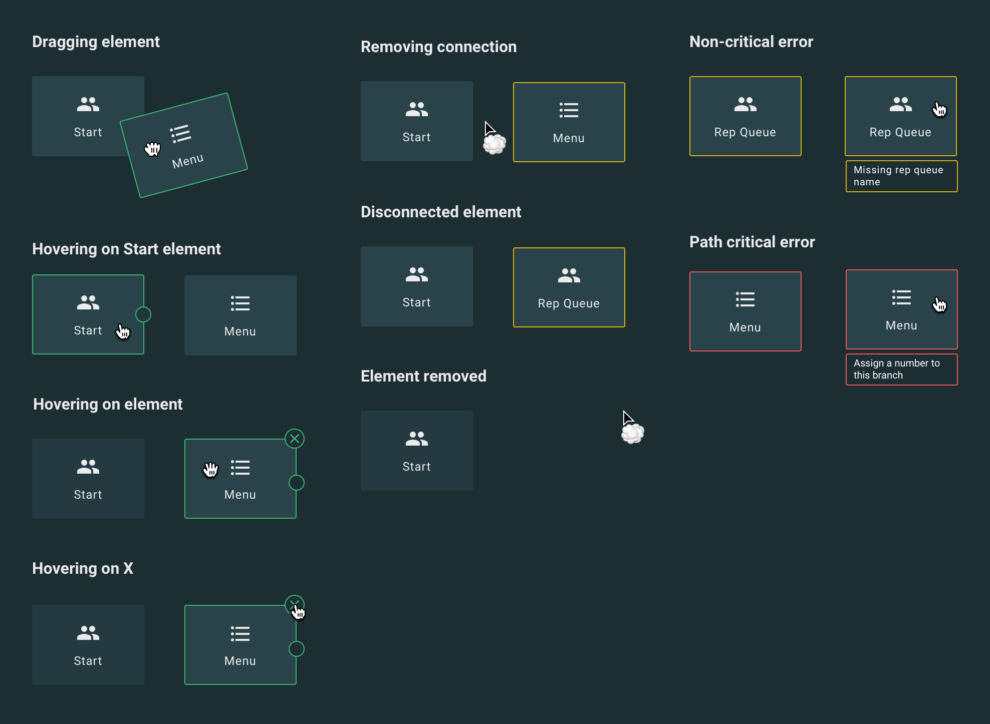
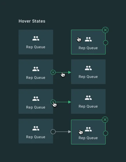
New interactions
Many of the possible interactions with the nodes were either nonexistent or unclear. After some research about best practices for drag-and drop interfaces, I created this key for the engineering team so that all appropriate affordances were in place. I used color to differentiate error states and kept the error messages descriptive and in-context so a user would know how to fix them and in which element.
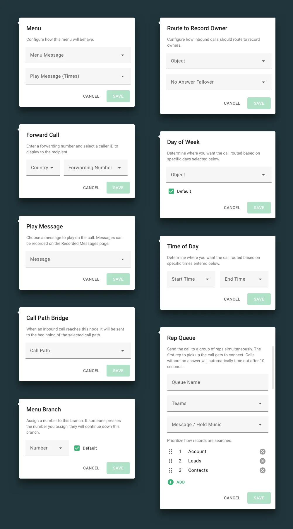
Dialog boxes
Instead of having the settings for each element open in a dialog box, I changed it to this position-relative carat that opens upon click. This improves visibility for the element and the rest of the call path as it doesn’t cover the element in question and doesn’t require a screen overlay as the rest of our dialog boxes do.
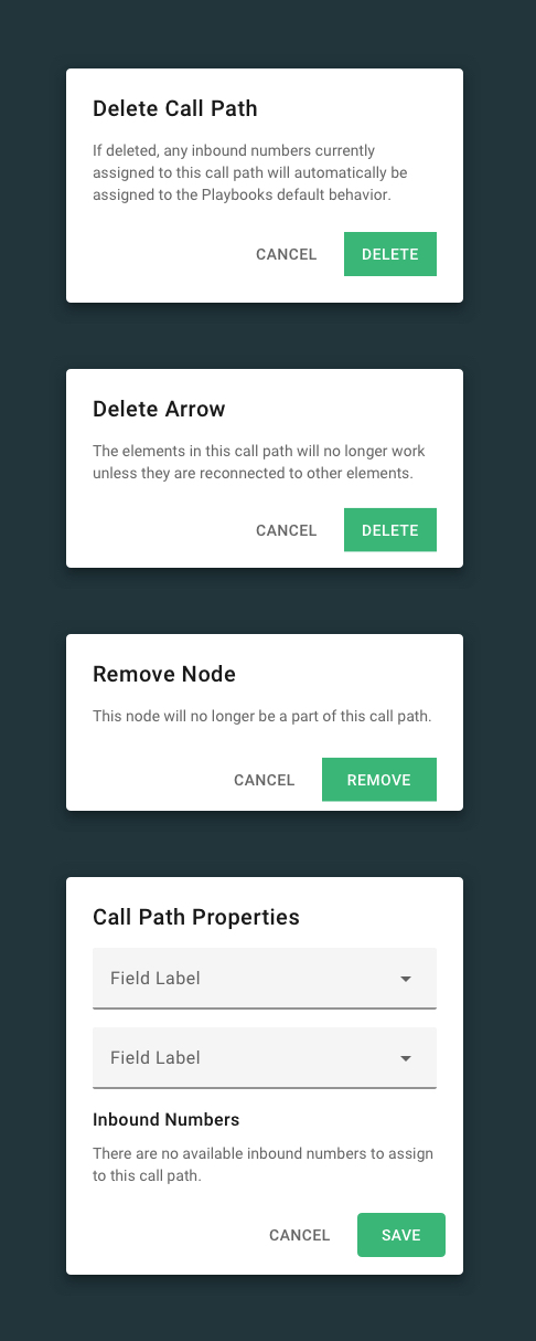
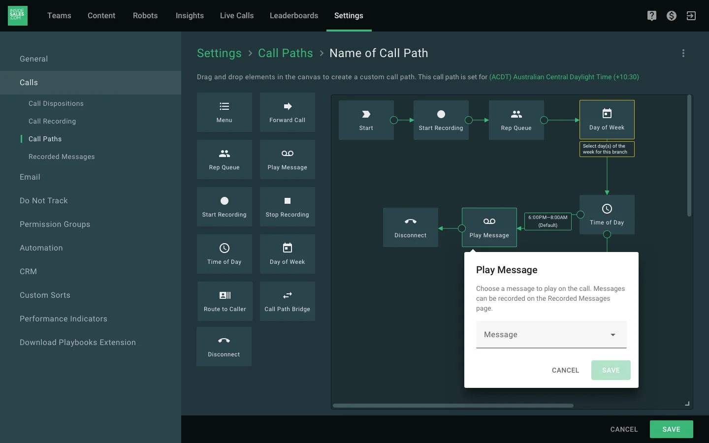
Final design
I mocked the design up with the largest dialog box and created several position examples so engineering could correctly place the carat depending on the elements X and Y values. I surfaced the timezone for each call path which was another critical element that was missing in the original.