Topic Labels
The problem
A nearly universal struggle for workplaces cultures is that managers and their direct reports are unable to have consistent and quality one-on-one conversations. They often are not sure what to talk about or how often to talk about certain subjects. Admins too, struggle to hold managers accountable to best one-on-one practices which would lead to greater employee satisfaction and retention.
This project was a result of years of interviews and competitive analysis, gathered by my product manager, including additional research we did together (see 3 snapshots below) that quantified pain points of having one-on-one conversations. We also interviewed both external and internal HR Administrators about the types of topics their company expected to be discussed.
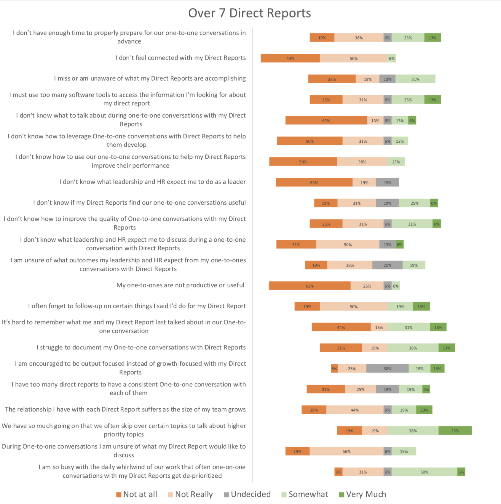
Manager responses
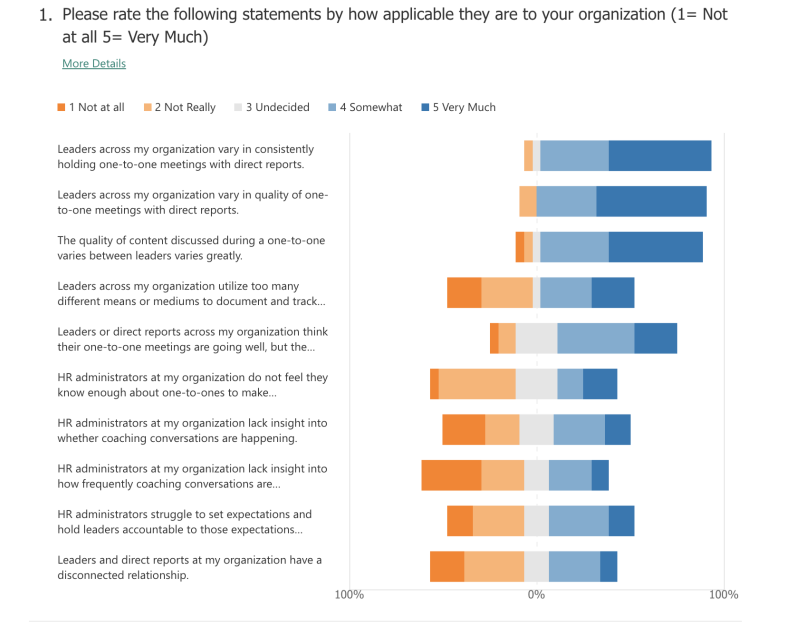
Administrator responses
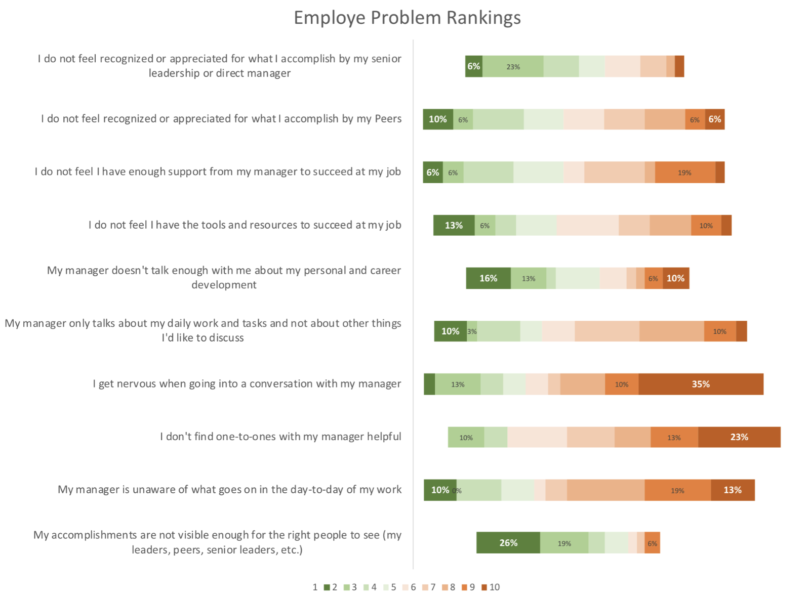
Employee responses
Each user type also had free-form responses to elaborate and add on additional pain points from above.
Why labels?
Labels, or tags as they are called in some applications, would educate users about which topics are worth discussing and allow them to categorize and track their discussions over certain topics. Another key point is that this model fit in well with the existing UX, front-end, and back-end architectures so it was a seamless and integrated addition into a user’s existing workflow.
Beginning design
Each year, OC Tanner does an immense research project with thousands of participants to discuss all aspects of company culture, including one-on-ones. I read through that again before this project and gleaned the helpful information that would apply, and then began asking questions, making notes, and sketching initial ideas.
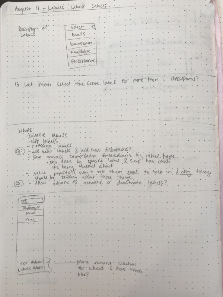
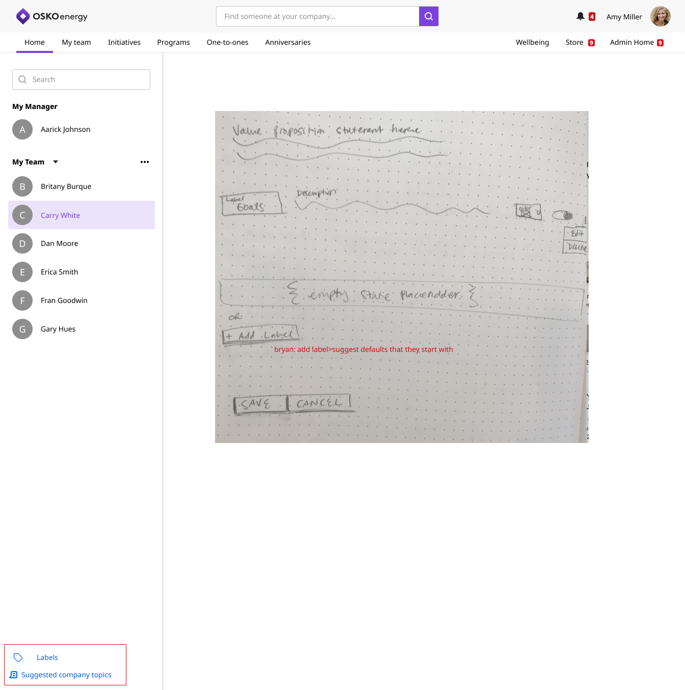
Wireframes
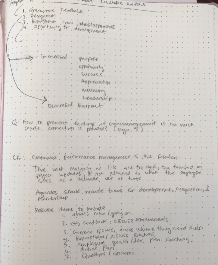
The crazy part of this project is that the design work was simple—it was the cross-department collaboration was the difficult part. Here is a wireframe I started with before realizing we should emphasize labels more and have a drawer open for them automatically, as to prompt users to engage with them and increase the likelihood that they would recognize topics of conversations that were worth discussing.
Cross-department teamwork
By far the biggest hurdle we had to overcome with this project was the struggle we faced with our Institute department that recommends and provides instructive material for our customers. They felt strongly that they could provide us with specific labels for our customers to use. The only issue we experienced when we tested these is that everyone interprets topics of conversation and words differently. Language translations also posed another roadblock we had to overcome.
One of many examples that showed how a discussion topic can be interpreted wildly different, depending on the person.
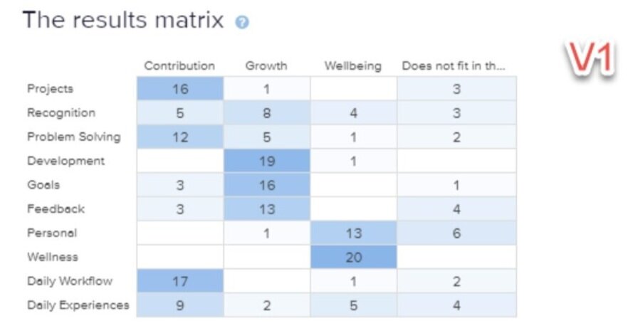
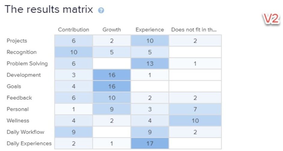
We also ran 2 closed cart sorts to further determine effectiveness of specific labels if they were housed into 3 categories (Wellbeing or Experience, Growth, and Contribution) that were recommended to us by our Institute department. This helped us solidify our more generic yet flexible labeling, and reduce confusion.
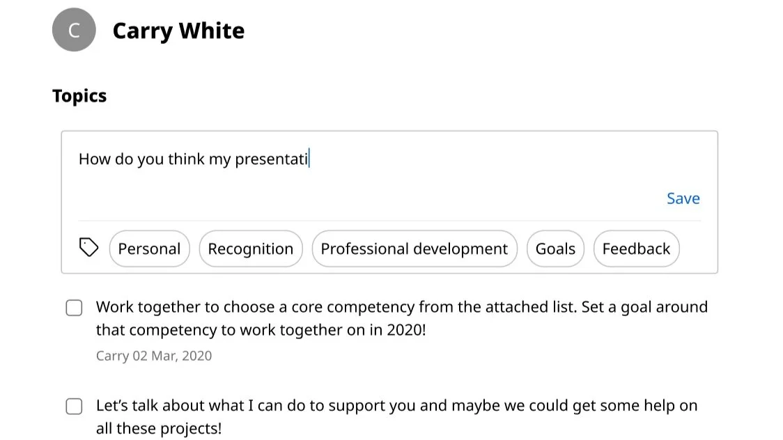
Finalized Design
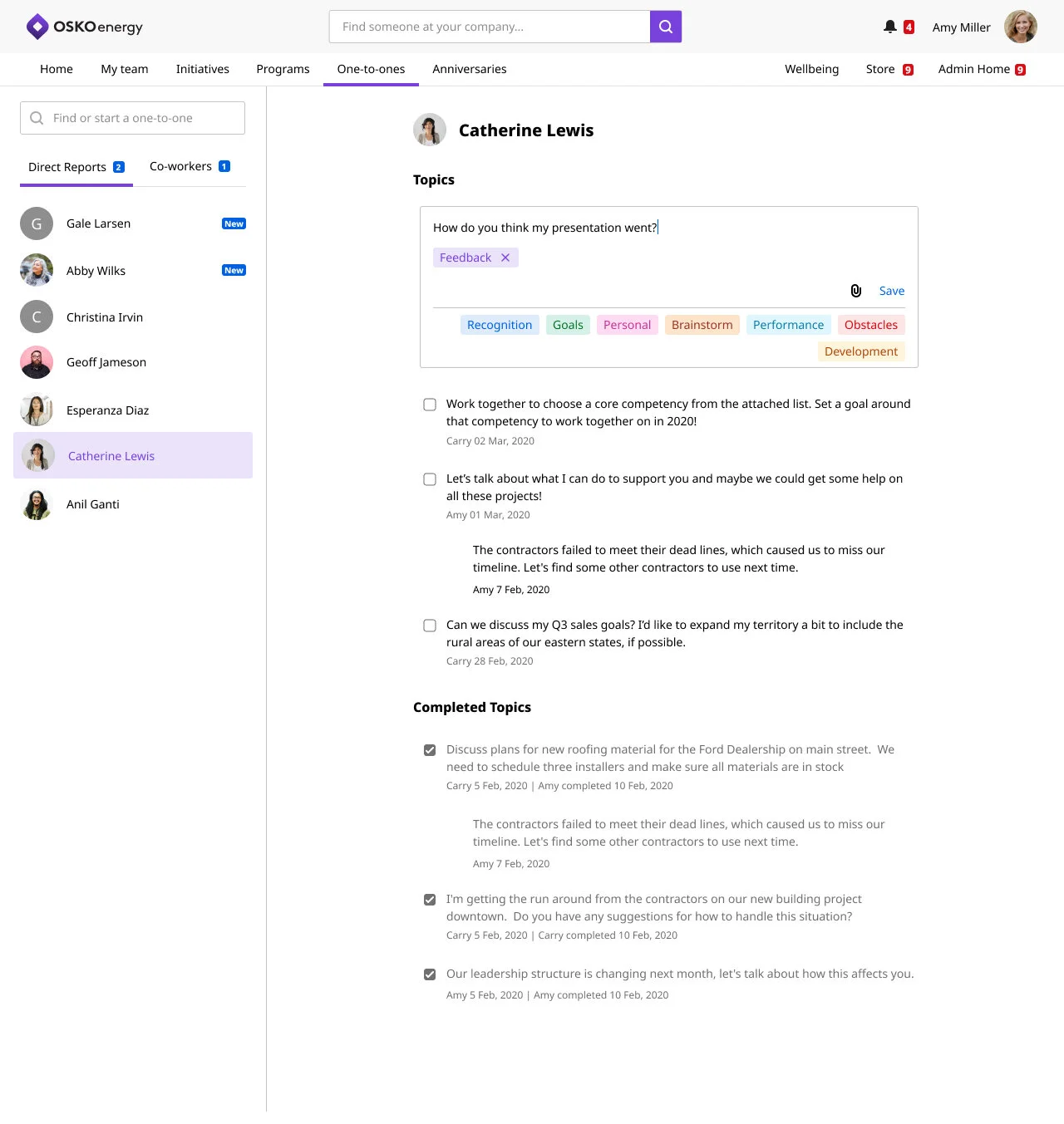
Users could add as many labels as they wanted so they could best describe and later locate topics
I used labels as an appropriate opportunity to introduce color into our otherwise plain interface.
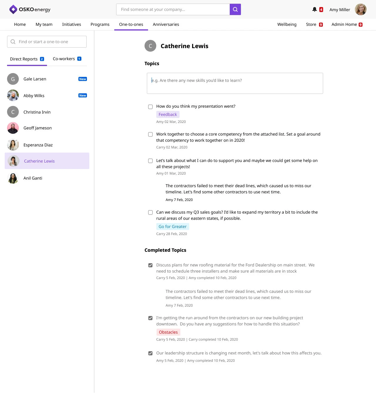
Another key element of this flexible design was the ability to add labels to a an already created topic in the same way a user was accustomed to adding things like comments and attachments.
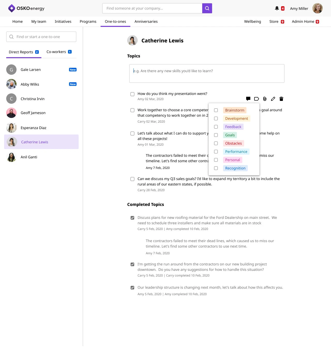
Please ignore the inconsistent icons that make up our design system
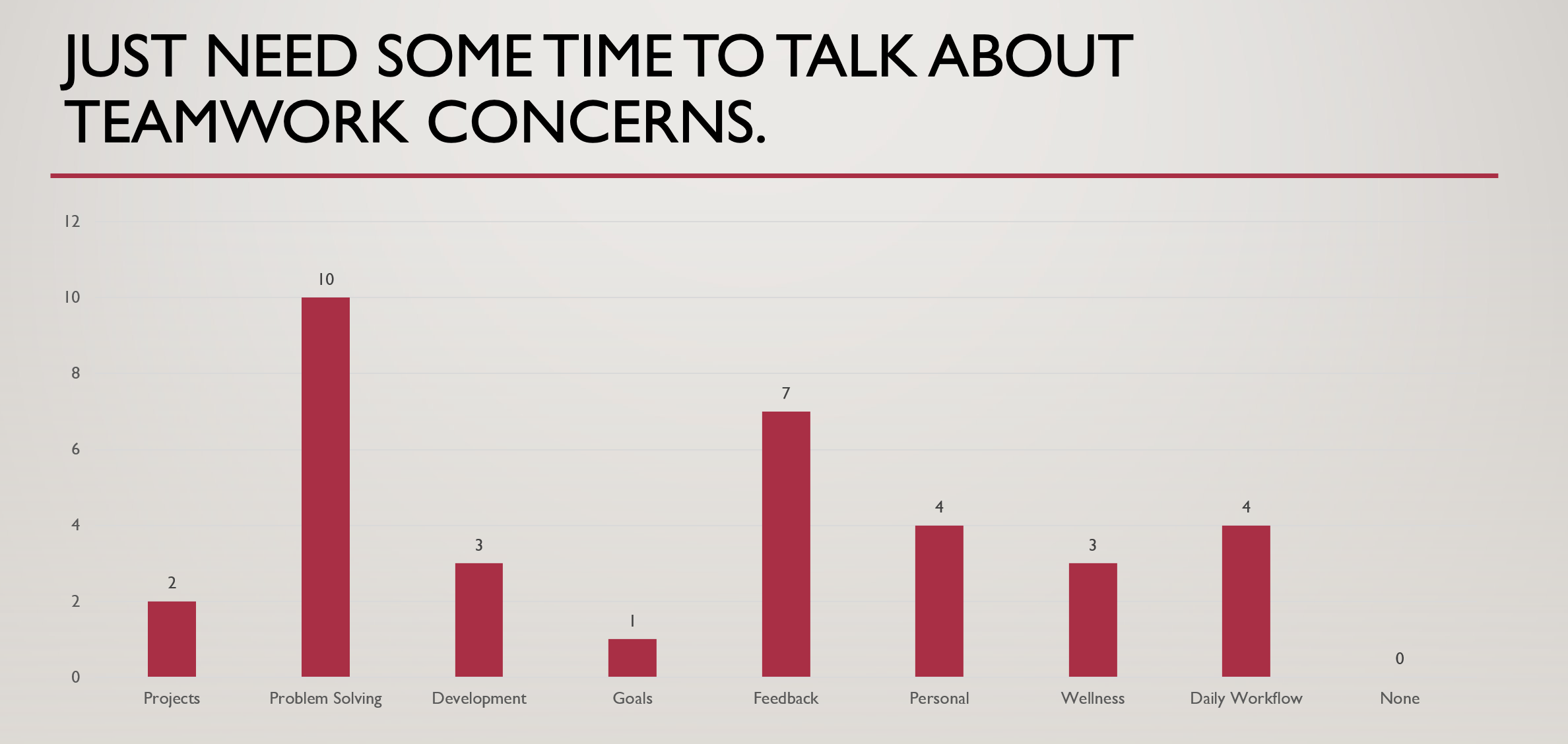
Reporting
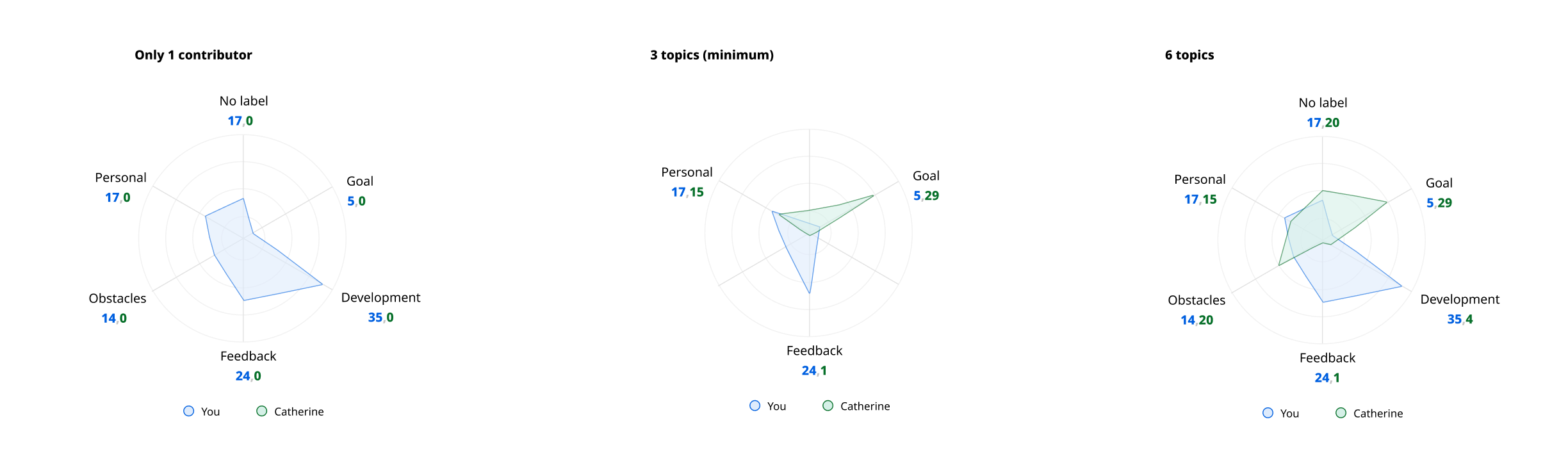
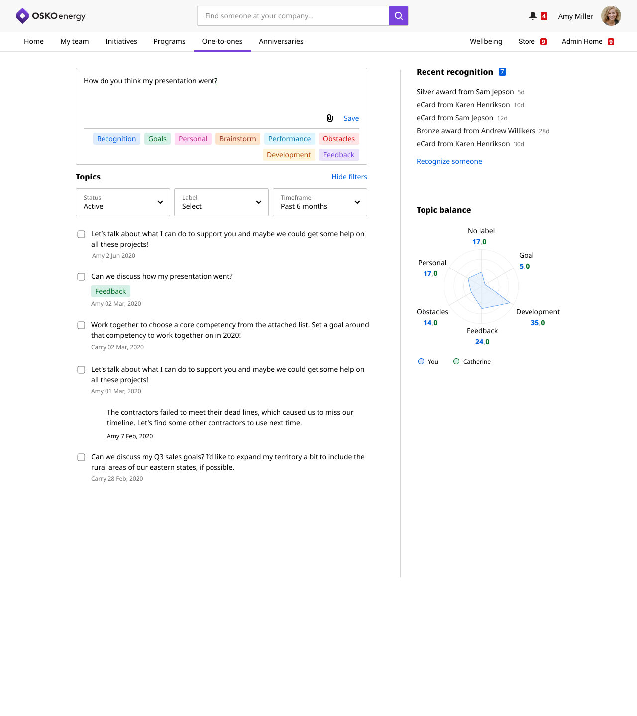
A key challenge of communicating both type of conversation and level of co-createdness was how to display it to the user. The spider graphs I designed tested equally well as the bar graphs but had the added benefit of being flexible—both in terms of number of topics so the graph could grow or shrink depending on the organizations use of labels and in working for both a manager only view when they viewed their entire team vs an individual, one-on-one view. .
The following 2 images are draft pages for what landing pages (a future project) could look like for both a manager, who could see individual reporting and team level reporting, and a direct report who can focus on just seeing the labels they utilize with their manager.
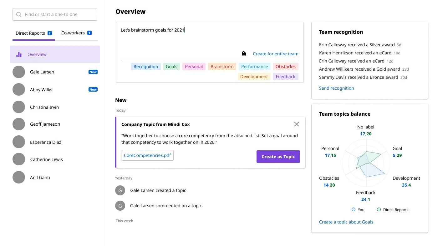
Draft of manager view
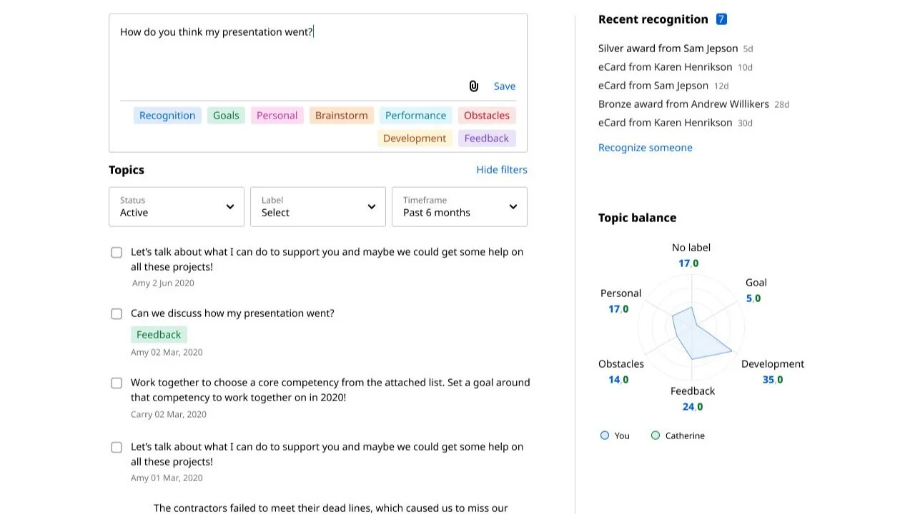
Draft of employee view
Next Steps
Giving the admins control over specific language used for each defined one-on-one category, as well as reporting for co-created and labels usage were the next iterations. Admins would be able to drill down from entire company to departments to individual teams, and perhaps even individual one-on-one conversations so they could manage and improve those relationships.
Filtering by label, for managers and their direct reports so they could see all Goals from 2020, for instance was another option we designed to be added later.