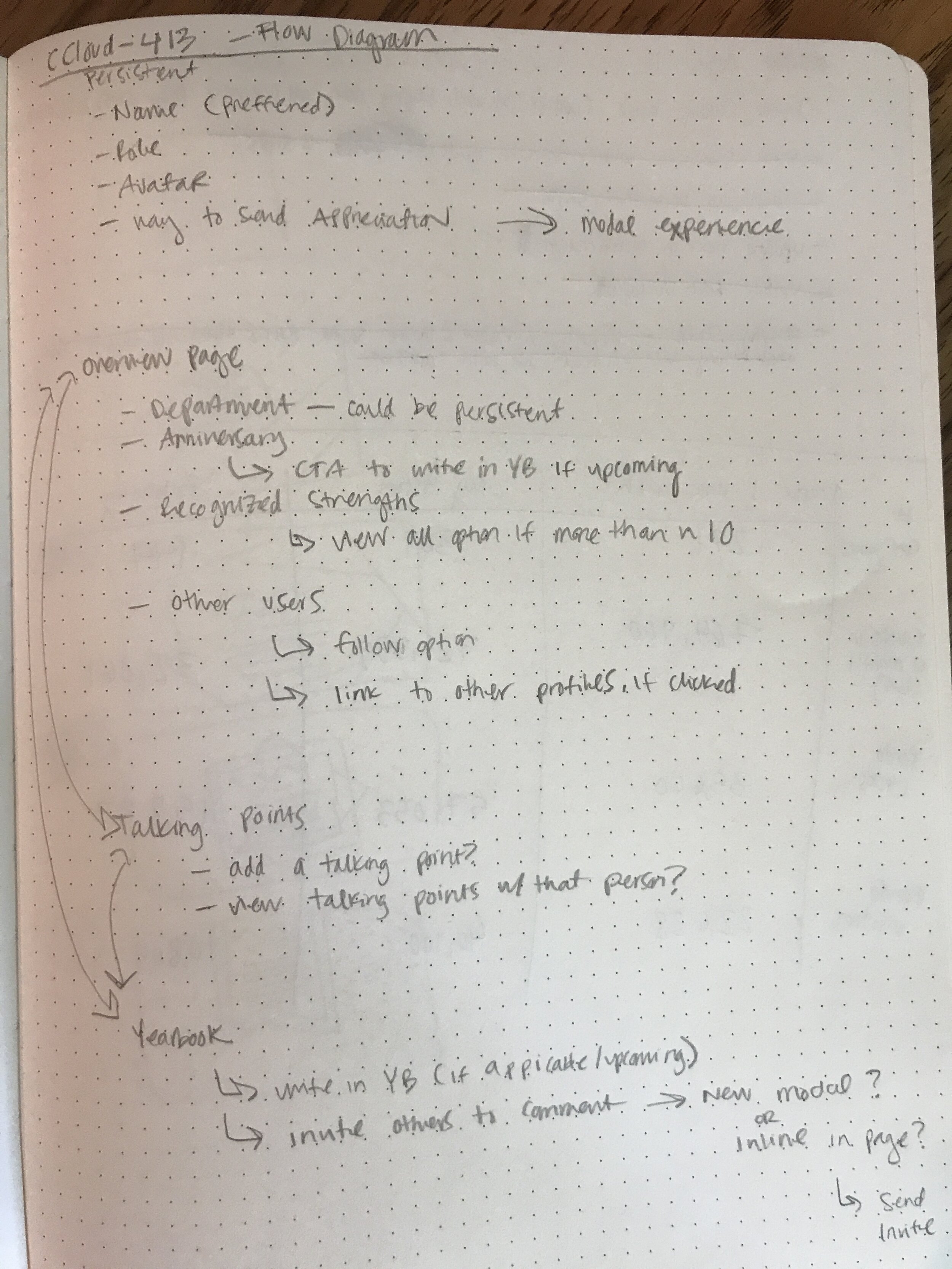
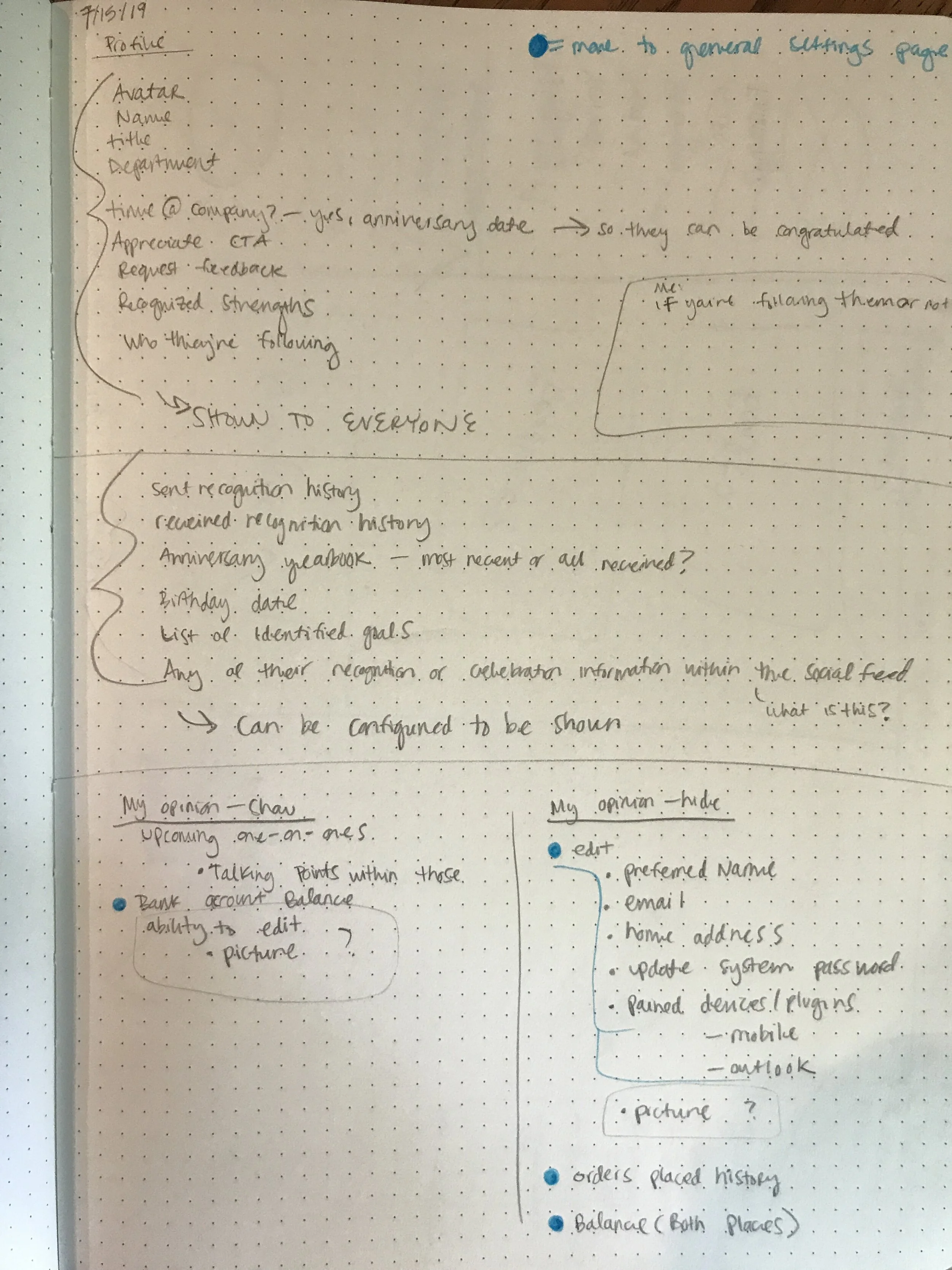
User profile
In my first couple of days on the job, I spent hours walking along a glass wall with all of the initial designs for our integrated application. Below are my initial questions and notes as I began to wrap my head around the product and the concept of a Profile page in our product.
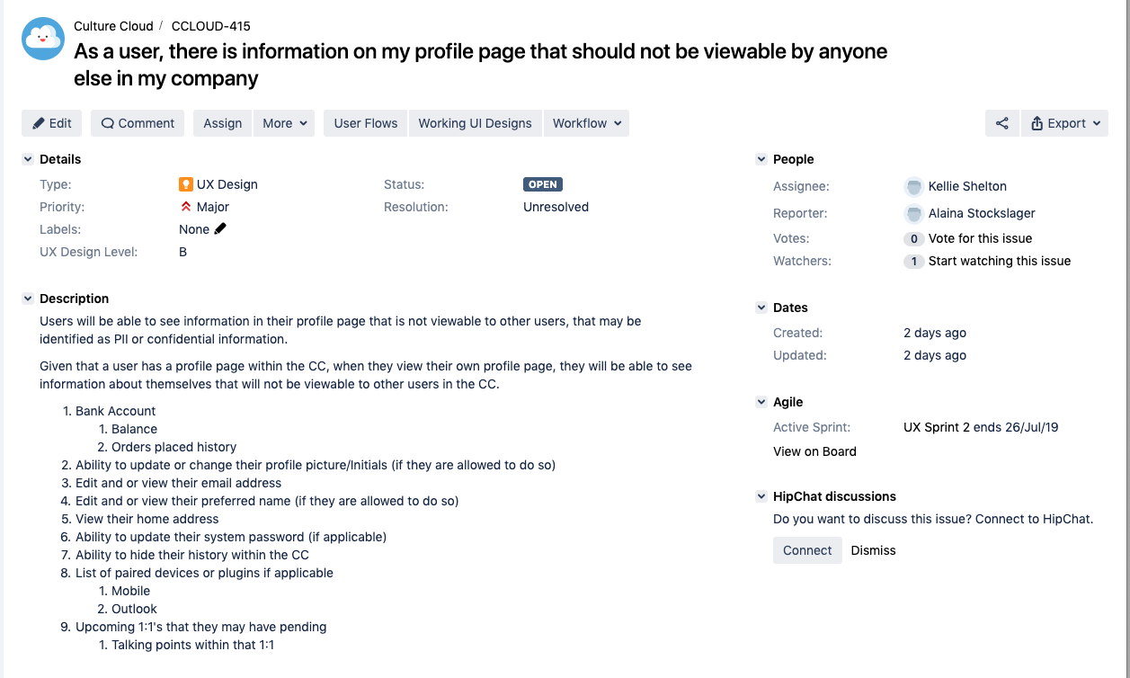
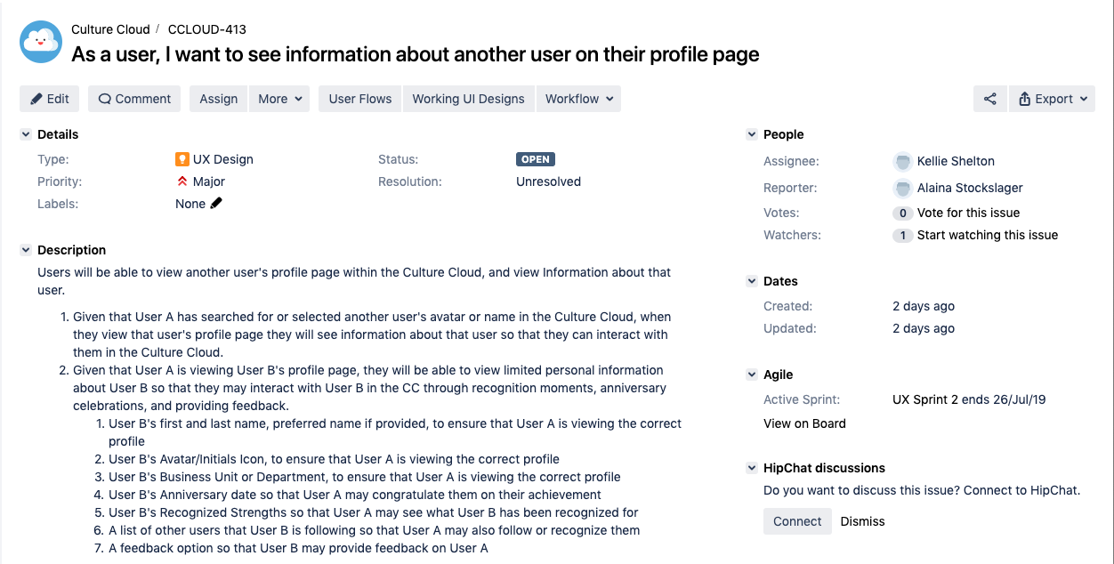
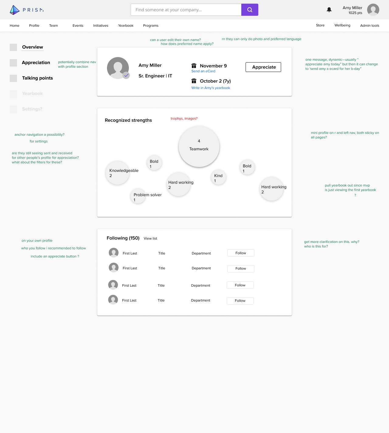
The current application our company was using was calling a Profile a collection of settings. In the Jira tickets my PM had prepared, it requested a lot of settings and random things be added. Having fresh eyes on the product, I rearchitected the information, alongside my engineering team, to keep public and private information separate as well as included an appropriately placed Settings section in the application.
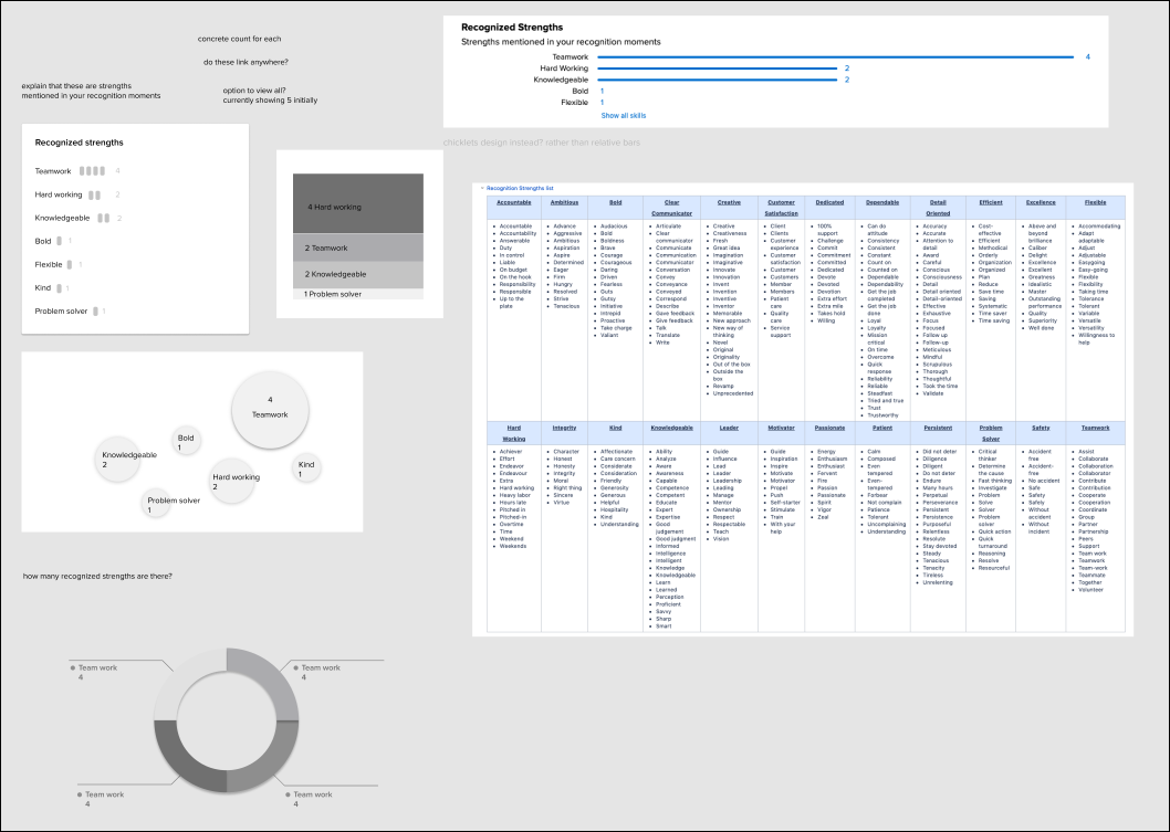
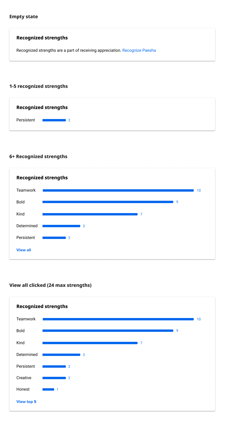
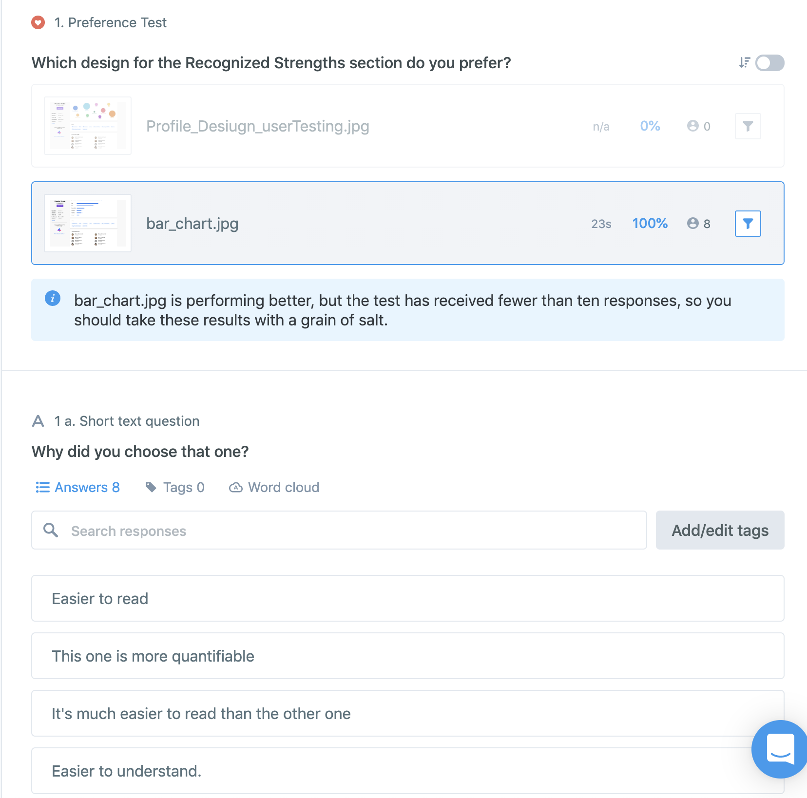
Playing with how the Recognized Strengths data could be redesigned
Testing
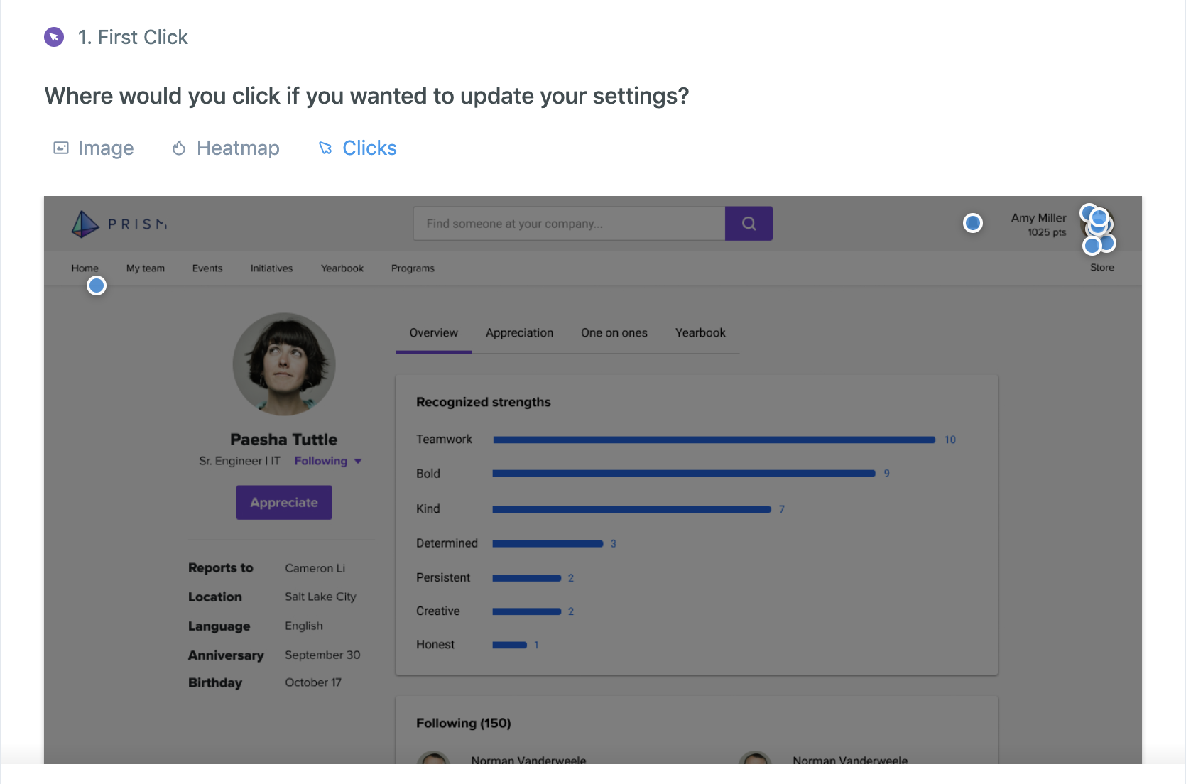
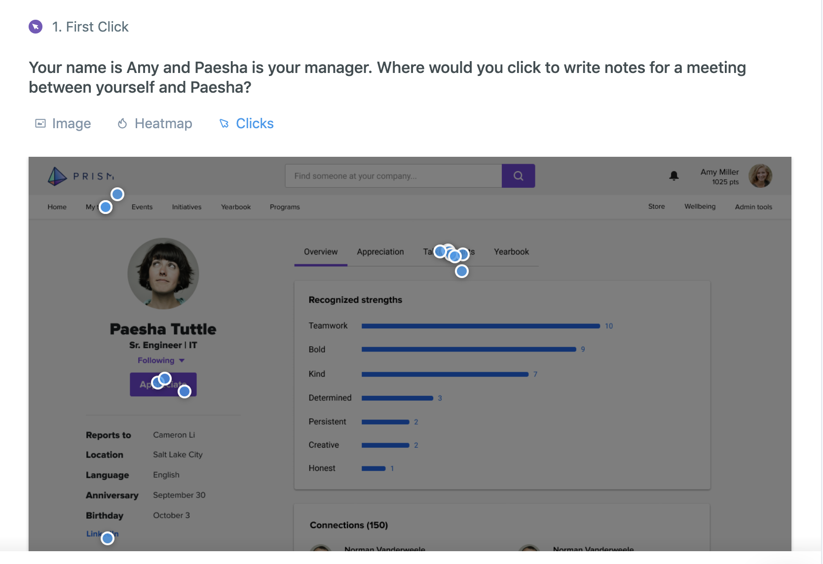
While we aren’t able to test with actual users, we did utilize Usabilityhub.com and UserTesting.com to target audiences like our users, and get feedback from over 140 people. We tested primarily navigation, preference of designs, and language in a series of 10 tests.
I also got general design feedback from my entire engineering team and posted my designs on a main wall in the office as they progressed over the course of a week to gather feedback of passerbys.
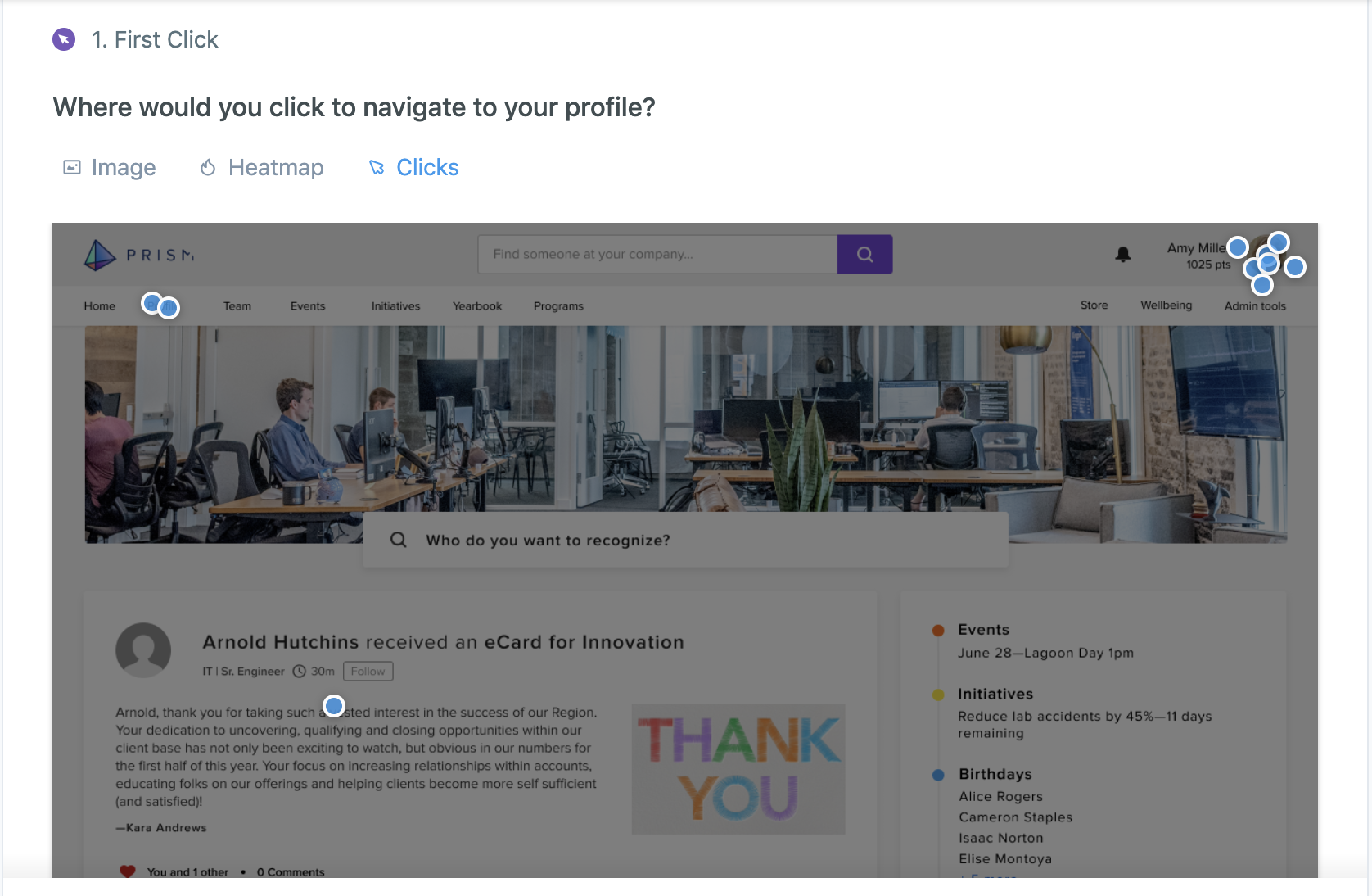
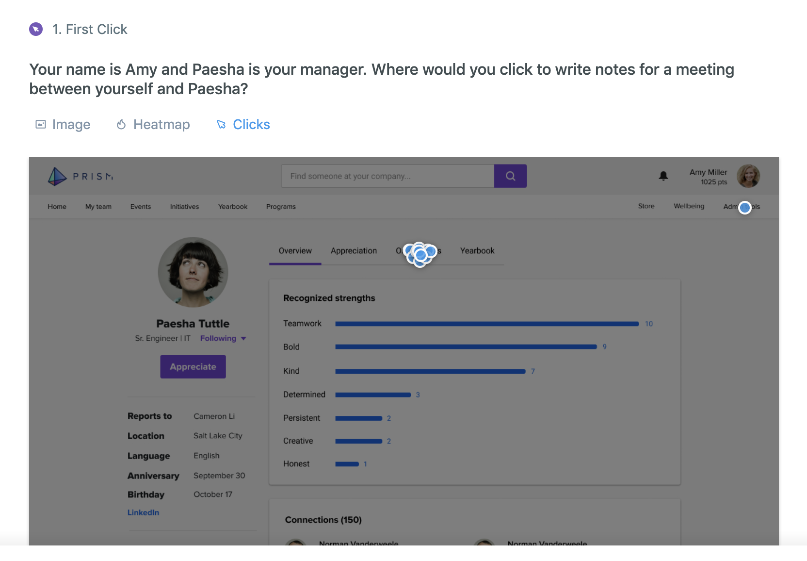
We actually put the word Profile in the nav, and only 2 people clicked on it. Surprising!
Total fail^
We also tested with a handful of people from UserTesting.com who matched our target audience. 4 out of 5 of them mentioned they were interested in seeing an org chart, which we will possibly include on the roadmap later, but it wasn’t something that was part of our plan or the interview. They were also successfully able to indicate the difference in the design between a Skills section (since postponed) and the Recognized Strengths section, which was a big win.
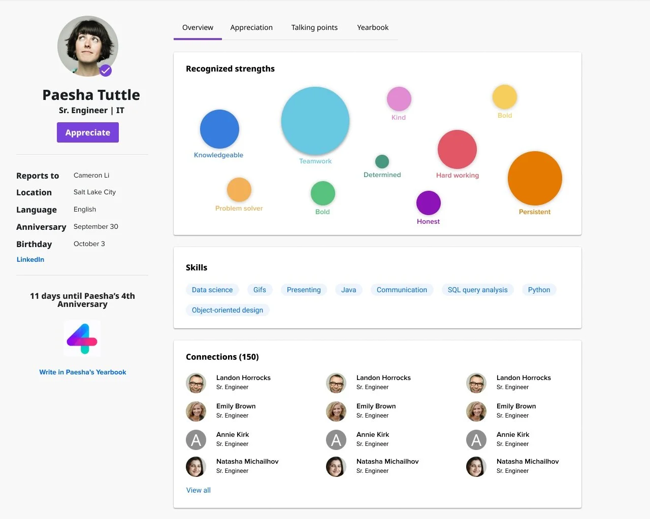
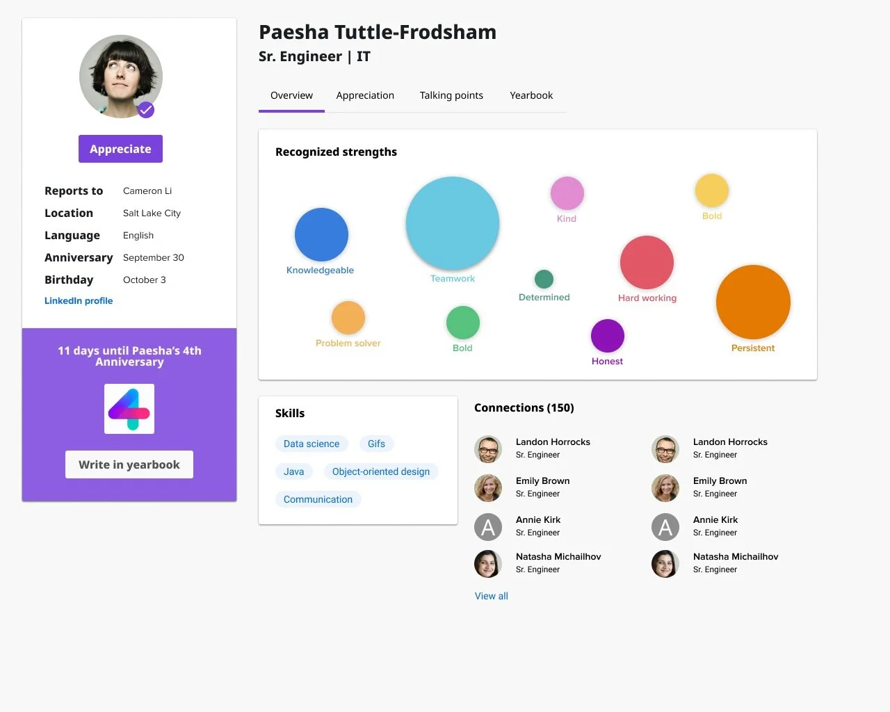
Final designs
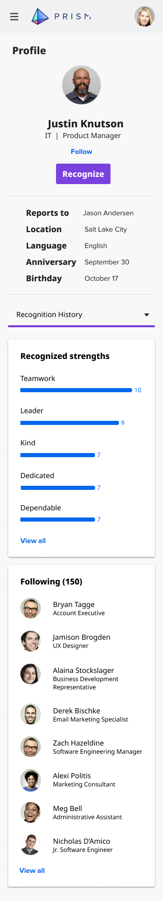
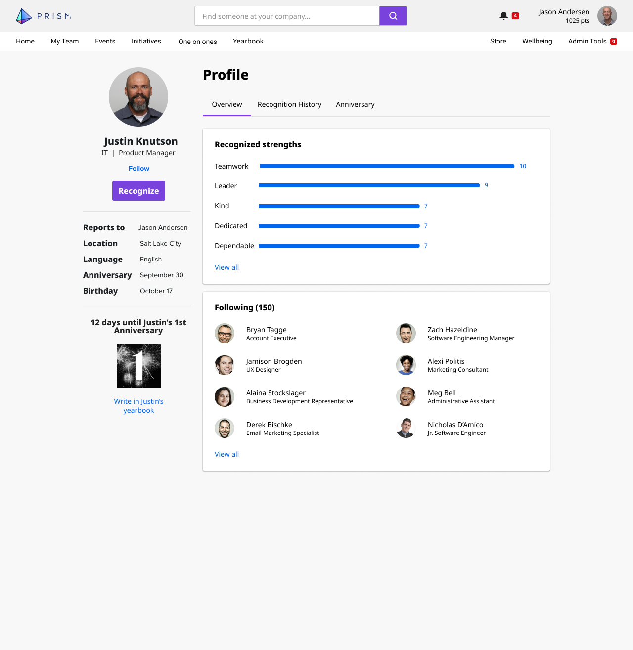
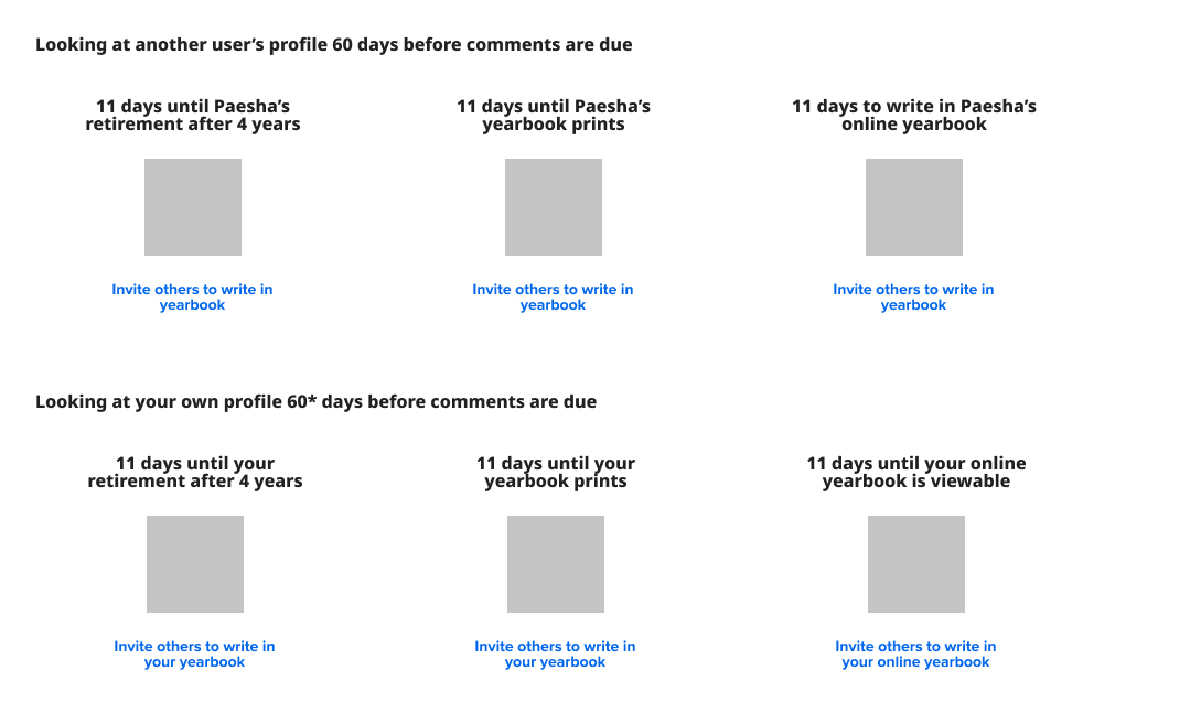
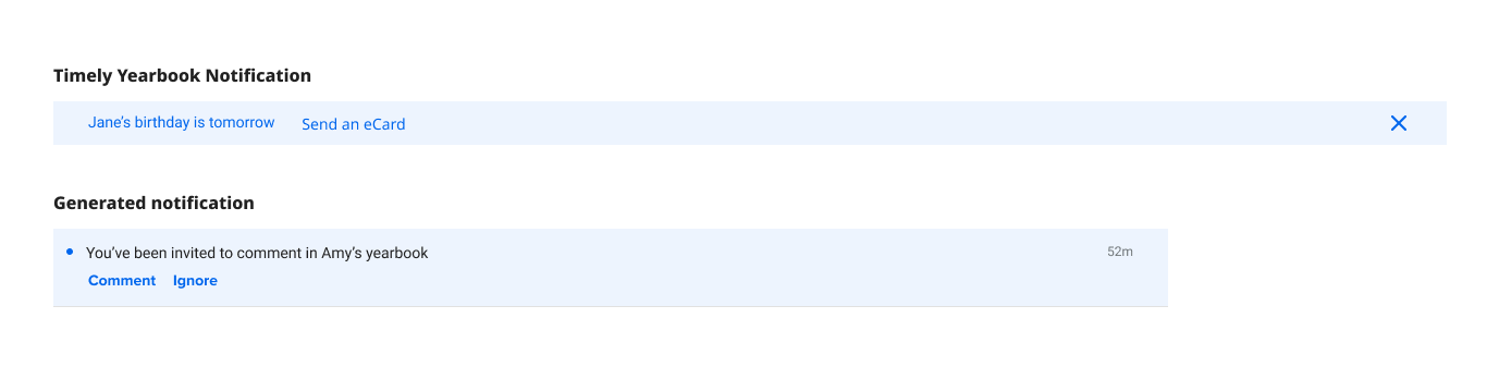
One key element on the page is the CTA to write in Justin’s yearbook. This is something that sees low user engagement, so I drew attention to it here underneath his user information. I worked with our on-site design center for those assets. The main CTA on the page, however, is the Recognize button, where users will send electronic eCards and awards.